Nghệ thuật xăm mình
 2:03 AM
 Unknown
Chúng ta bắt đầu với bức ảnh có hình xăm trước. Trước hết chọn "Magic Wand" rồi bấm chuột vào vùng trắng của ảnh, bạn phải chắc rằng cái phần nền của hình xăm phải trắng hoàn toàn. Sau đó thì select>inverse (shift+ctrl+i)  |
 Posted in
xăm mình
Sepia effect in Photoshop
 4:33 AM
 Unknown
In this tutorial you will learn how to add a sepia effect to an image in Photoshop. There are many ways to achieve this effect but I will be using the channel mixer. I have used a free stock image for this tutorial, a full list of site containing free stock images can be found here.
Sepia effect in Photoshop
Step 1
Open an image in Photoshop. I have used an image of a lion and lioness, but you can use any image.
Step 2
Remove the colour from the image by selecting on the menu bar Images > Adjustment > Desaturate. Alternative ways of removing colour can be found on this post.
Step 3
Now open up the channel mixer by selecting Images > Adjustment > Channel Mixer and add the following settings. I have set the output channel to red and the 35% for red, 70 for green and 10 for blue and 8% for the constant. You can feel free to change these settings to your liking.
You should now have a sepia effect in Photoshop and remember to subscribe in a RSS reader.
 Posted in
special effects
Quick tip 27 – Seeing font changes
 4:55 AM
 Unknown
This is part 27 of the Photoshop quick tip series where you will learn how to visually see the font changes in Photoshop. Normally when you type some text on the canvas and want to change the font, you have to manually have to select the font from the drop down menu to see a different font.
Now wouldn’t it be easily if you could see the font changes directly instead of manually cycling through all the fonts. There is a quick solution to this problem which is to click the font from the drop down menu. Then use the up and down keys on the keyboard to cycle through the fonts. This means you will visually see the changes from the font instead of manually change the fonts.
 Posted in
Quick tip series
Quick tip 26 – The hand tool
 3:29 AM
 Unknown
This is part 26 of the Photoshop quick tip series where you will learn how to quickly select the Hand tool. The hand tool is similar to the selection tool, but you can click and drag around the Photoshop document. The main function of this tool is basically navigation.
To use the Hand tool you need to firstly open an image in Photoshop. If you want to quickly open a document in PS, checkout quick tip 3.
On the toolbar the Hand tool can be located just above the foreground and background palettes. Another method is to hold down the spacebar which is a very useful keyboard shortcut. The great benefit of this tool is that it will activate no matter what tool is currently selected.
Now zoom into your image Ctrl + then select the Hand tool (Spacebar) and you will be able to move around the zoomed in image by clicking and dragging.
 Posted in
Quick tip series
If you like money, you need to do this - Sponsored Post
 7:48 AM
 Unknown
 Posted in
Airbrushing skin technique
 12:48 AM
 Unknown
I found an excellent skin airbrushing tutorial over at tutorialpulse.com. This is a detailed thirteen step tutorial which layouts exactly how to have smooth skin using Photoshop. Each step contains a detailed description as well as a high resolution image to explain the procedures. The full article can be found here.
There is also an option to download the source files for free. If you want more digital makeovers checkout the, Digital makeover series and remember to subscribe.
 Posted in
Digital series,
photo retouch
Photoshop is 20 years old
 7:34 AM
 Unknown
Today, 19/02/10, Adobe Photoshop is 20 years old. Photoshop has remained successful for the whole 20 years. It started as a black and white image editing program and now it has grown to a multi-product franchise with many different products in the Adobe family. As the years have progress Photoshop has develop new features with every new release and each time the interface get even better and more refined.
Over at the photoshopuser.com you can find details of an event which will take place to pay homage to this program. I believe Adobe are putting on an event to celebrate the 20 years since the first release of Photoshop 1.0.
 Posted in
Articles
Auto Contrast in Photoshop
 5:39 AM
 Unknown
When you take Photographs outdoors, the weather can be misty, cloudy and hazy which can have a dull effect on your Photographs. You can try manually adjusting the contrast, brightness and gamma of the image, but this can take some time to tweak. A quick method of fixing the contrast in Photo is to use the Auto Contrast feature. The auto contrast works by adjusting shadows and highlights values in an image and then set the darkest and lightest pixels to pure black or pure white. This makes the highlights appear lighter and shadows darker and improves the appearance of your photographs.
To use the Auto contrast feature, follow the steps below.
1. Open up an image you wish to edit in Photoshop. To quickly auto up an image, checkout quick tip 3.
2. Then select Image > Auto Contrast if you are using Photoshop CS4. If you are using CS3 you may have to select Image > Adjustments > Auto Contrast.
 Posted in
Articles
Quick tip 25 – Black and white image
 5:33 AM
 Unknown
This is part 25 of the Photoshop quick tip series where you will learn how to convert an image into black and white. I have actually previously created a tutorial that show you how to turn an image black and white which can be found here. I will be briefly discussing these methods in this quick tip.
The first method involves changing the default RGB mode in a colour image to the greyscale mode. This is not the most common method of converting to a black and white image. If you are using Photoshop CS4 you will receive a message asking if you want to discard the colour information. You click the discard button if you want to follow through with the conversion.
The second method is the most common and can be done through the menu bar or using shortcut keys. The default desaturate keyboard shortcut is Shift + Ctrl + U, or the menu bar option is Image > Adjustment > Desaturate.
The third method is similar to the second as it desaturate the image, the only difference is that it takes more time. You again can use keyboard shortcuts (Ctrl + U), or you can go through the menu bar by selecting Image > Adjustment > Hue/Saturation.
 Posted in
Quick tip series
Quick tip 24 – Close multiple windows
 4:43 AM
 Unknown
This is part 24 of the Photoshop quick tip series where you will learn how to close multiple windows in Photoshop. If you have several windows open in Photoshop you will receive a message asking whether you want to close down the window. This is not a problem if you have one or two windows, but if you have over ten windows open, this will be a very time consuming problem. When you close a window you get the following message.
There are two methods to close multiple windows. The first method is to hold down the Shift key then select File > Close on the menu bar. Or you can go directly to the menu bar and select File > Close All. This will close all the opened windows in Photoshop.
 Posted in
Quick tip series
Reset The Preferences When You Start Up Photoshop
 11:33 PM
 Unknown
Reset The Preferences When You Start Up Photoshop
Photoshop may be the world's most popular and powerful image editor, but like most things in life, especially computer-related things, it's not perfect. Sometimes, for no apparent reason, Photoshop can start acting funny on you. One common cause has to do with Photoshop's Preferences. Sometimes, they can get messed up. Fortunately, Adobe makes it easy to reset the preferences if we need to.
If Photoshop is already open on your screen, close out of it. Then hold down Shift+Ctrl+Alt (Win) / Shift+Command+Option (Mac) on your keyboard and start Photoshop back up. The very first thing you'll see is a dialog box that pops up asking if you want to delete the existing Preferences file (which it calls the "Settings" file):

To reset Photoshop Preferences to the defaults, click Yes in the dialog box. The existing Preferences file will be scrapped and a brand new one will be created.
 Posted in
tips and tricks
Top 10 Killer photoshop combo moves
 11:31 PM
 Unknown
10. Cloak of Invisibility
Remove everything from the screen except for your file.
- F, F, F | Cycle through Screen Modes
- Tab | Remove Tools and Palettes
- Ctrl+H | Hide Extras (Grid, Guides, Slices, etc.)
- Ctrl+R | Hide Rulers
9. Quick Brush Jab
Quickly and easily customize a brush. This combo is a staple for digital painting.
- B | Brush Tool
- Right-Click and Select or F5 and Select | Open condensed or full Brush Palette
- or . or , or Shift+. or Shift+, | Cycle through brushes or jump to first or last brush
- [ or ]: | Shrink or enlarge brush radius
- Shift+[ or Shift+] | Decrease or increase brush hardness
- {Numeric Input} | Change brush opacity (e.g. ‘5′ = 50%, ‘55′ = 55%)
8. Quick Brush Jab Path Stroke
Stroke a path with a customized brush.
- {Draw Path} | Use any tool to draw a path
- B | Select Brush Tool
- Quick Brush Jab | Use the Quick Brush Jab Combo to customize brush
- Enter | Stroke the path with your customized brush
7. Gaussian Attack
Apply a filter, fade it and apply again. Good combo for fine-tweaking filters.
- {Apply a Filter} | Manually choose and apply a filter (warning: using the Lens Flare filter may result in a swift kick to the mouse balls)
- Ctrl+Shift+F | Fade the filter
- (Ctrl+F or Ctrl+Shift+F) | Reapply filter with or without dialog box
6. Shadow Maker
Create a basic shadow based on a chosen layer.
- {Select Layer} | Select the layer the shadow will be created after. The transparency of this layer needs to resemble the desired shape of the shadow.
- Ctrl+J | Layer via Copy
- Ctrl+[ | Move layer down
- D | Reset color defaults
- Alt+Shift+Backspace | Fill with black and preserve transparency
- Ctrl+T | Free transform
- {Transform} | Modify to your liking
- Enter | Commit
5. Layer Catcher
Select, group and mask layers. Often easier than using the layers palette.
- V | Selection Tool
- Ctrl+Click or Ctrl+Shift+Click or Ctrl+Shift+Right-Click | Select your layers
- Ctrl+G | Group Layers
4. OCD Layer Sort
Rearrange your layers quickly and easily. Great cure for you neuroticism.
- F7 | Show Layer Palette
- Alt+[ or Alt+] or Alt+, or Alt+. | Select a layer
- Shift+Alt+[ or Shift+Alt+] or Shift+Alt+, or Shift+Alt+. | Select more layers
- Ctrl+[ or Ctrl+] or Shift+Ctrl+[ or Shift+Control+] | Move layers down or up or send to bottom or bring to top
3. Ultimate Flattener
Merge All Layers (even those hidden). Quick way to flatten a file.
- Alt+. | Select Top Layer
- Shift+Alt+, | Select all layers between currently selected and bottom layer
- Ctrl+E | Merge the selected layers
2. Infinite Dupe
Duplicate and evenly distribute or transform items. Nice way to distribute something like nav buttons.
- Ctrl+T | Transform
- {Transform/Move} | Manually Move or Transform
- Enter | Commit Transform
- (Ctrl+Alt+Shift+T) | Duplicate and transform relative to the newest item
1. Finishing Move – The Web Extractor
Extract a selection and save it for the web. Extremely useful when pulling individual elements from a design, such as buttons or rules.
- {Create Selection} | Select the area you want to extract
- Ctrl+Shift+C | Copy Merged to clipboard
- Ctrl+N | Create New Image based on selection size
- Enter | Confirm New Image
- Ctrl+V | Paste from clipboard
- Ctrl+Alt+Shift+S | Save for the Web
 Posted in
Photoshop Căn Bản
Photoshop Quick Tips #3 - Enhancing Photos with High Pass Filter
 11:29 PM
 Unknown
Step 1
Open a regular photo in Photoshop. I used a photo of a cat that I found on sxc.hu http://www.sxc.hu/photo/1069561

Step 2
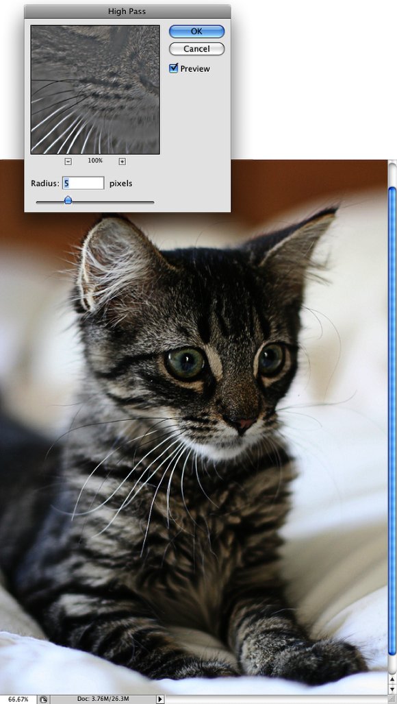
Duplicate the layer and go to Filter>Other>High Pass. Use 5 pixels. Then change the Blend Mode of the layer to Hard Light.
Step 3
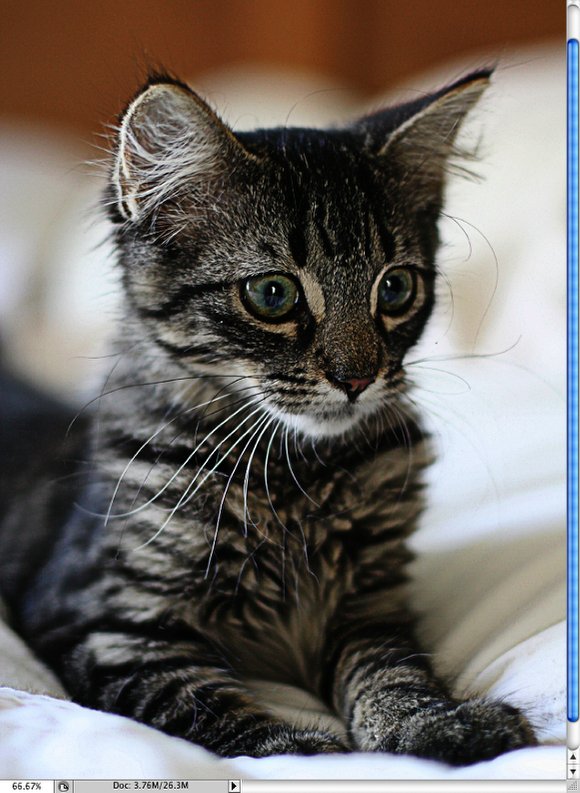
Duplicate the High Pass layer. Keep the blend mode with Hard LIght.
Step 4
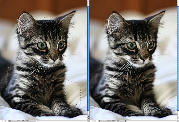
Duplicate the original photo and change its Blend Mode to Screen. Then with the Eraser Tool (E) or with a Mask. Delete the dark areas of the photo. Leave just the light areas, the eyes, nose, and mouth. Below you can see the areas I kept, the marquee selection.
Step 5
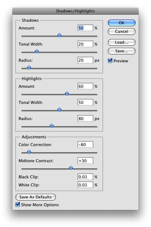
Group all layers and convert them to Smart Objects, Layers>Smart Objects>Convert to Smart Objects. Or if you prefer just merge the layers. Then go to Image >Adjustments>Shadow and Highlights. Use the values from the image below. With this adjustment you can edit how the shadows and highlights will be displayed, and you can simulate the HDR effect by increasing the Tonal Width and Radius on the Shadow and Highlights, and, also the Midtone Contrast.
Conclusion
This is just one way to enhance your photos, you can use the Unsharp Mask filter as well. But I prefer the high pass with hard light, I think it gives a better result, however that will depend the photo you are working on. The most important thing is test and play with the settings and of course add more techniques to your repertoire. If you have a different quick tip, leave a comment sharing and explaining it to us ;).

Step 1
Open a regular photo in Photoshop. I used a photo of a cat that I found on sxc.hu http://www.sxc.hu/photo/1069561

Step 2
Duplicate the layer and go to Filter>Other>High Pass. Use 5 pixels. Then change the Blend Mode of the layer to Hard Light.

Step 3
Duplicate the High Pass layer. Keep the blend mode with Hard LIght.

Step 4
Duplicate the original photo and change its Blend Mode to Screen. Then with the Eraser Tool (E) or with a Mask. Delete the dark areas of the photo. Leave just the light areas, the eyes, nose, and mouth. Below you can see the areas I kept, the marquee selection.

Step 5
Group all layers and convert them to Smart Objects, Layers>Smart Objects>Convert to Smart Objects. Or if you prefer just merge the layers. Then go to Image >Adjustments>Shadow and Highlights. Use the values from the image below. With this adjustment you can edit how the shadows and highlights will be displayed, and you can simulate the HDR effect by increasing the Tonal Width and Radius on the Shadow and Highlights, and, also the Midtone Contrast.

Conclusion
This is just one way to enhance your photos, you can use the Unsharp Mask filter as well. But I prefer the high pass with hard light, I think it gives a better result, however that will depend the photo you are working on. The most important thing is test and play with the settings and of course add more techniques to your repertoire. If you have a different quick tip, leave a comment sharing and explaining it to us ;).

 Posted in
Photoshop Art
Magic Extractor - Change Background in Photoshop
 11:26 PM
 Unknown
This tutorial is an advanced guide covering how to use the Magic Extractor to change background in Photoshop. The Magic Extractor is an incredible useful tool, and something that can be used for many art projects.
To open up the Magic Extractor, go to Image> Magic Extractor.
First of all, let me explain the uses of the various tools in the Magic Extractor. I've composed a list and made a diagram to make it as clear for you as possible. Click on any the images in this post to see a larger version.
Diagram of main tools in Photoshop's Magic Extractor
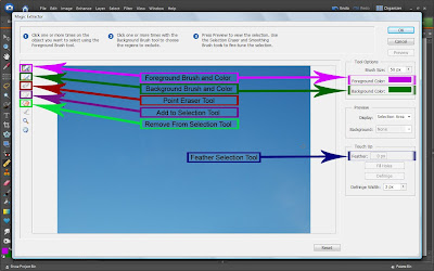
- Foreground Brush - Paint or scribble over what you want to keep.
- Background Brush - Paint or scribble over what you want to get rid of.
- Point Eraser Tool - Correct any mistakes you made with the Fore/Background Brushes.
- Remove From Selection Tool - Remove parts of the image, leaving transparency.
- Add to Selection Tool - Restore any parts of the image deleted by the Remove from Selection Tool
- Feather Selection Tool - Soften the edges of your selection by any radius you wish.
Foreground and Background Brushes
Wrong
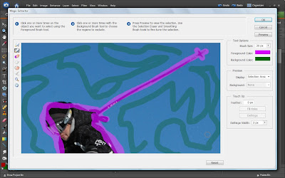 Right
Right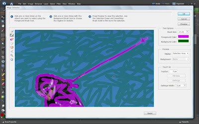 Point Eraser Tool
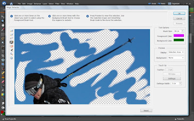
Remove from Selection and Add to Selection Tools
I don't use these tools very much, but when trying to remove an especially complicated background, they can be very useful. This tool is very exact, and has the same effect of the Eraser tool in Photoshop's User Interface. Using the Remove from selection tool will erase any part of the image that you want, leaving you with transparency. If you make any mistakes, the Add to Selection Tool can be used to bring any part of the image back. I've always found it best to first use the foreground and background brushes, then use these tools to erase any background that might have been left behind. This is an example of the image after I have used the Remove from Selection Tool to remove some of the background, and then restore parts of it with the Add to Selection Tool.
 Posted in
Photoshop Tricks
Photoshop Tips & Tricks — Variety Pack Volume 1
 11:24 PM
 Unknown
Here is a collection of useful tips and tricks to improve your Photoshop skills.
Ten Golden Tricks
1. Hitting Tab hides all of your palettes. Hitting Tab again brings them back.
2. Shift+Tab hides all the pallets except your toolbar.
3. Hitting the "D" key resets your color pallets to Black foreground, White Background.
4. The "X" key will toggle your foreground and background colors.
5. Use CMD+Delete to fill your layer or selection with the current background color.
6. Option+Delete fills your layer or selection with the foreground color.
7. Change your paintbrush circle into a crosshair for precise control by pressing the Caps Lock key.
8. Double-Click the ruler on the top or side of your document brings up the Units & Ruler Dialogue box. (handy if you work in both print and web)
9. To quickly change the blend mode of a layer Shift+Option+(letter corresponding to mode) ie: Shift+Option+M is Multiply. Shift+Option+V is Vivid Light.
10. Using Shift+ the "+" or "-" will toggle through the various blend modes one at a time.
Speed Up File Browser
Adobe Photoshop tutorialIf you feel your File Browser is too slow in generating previews, you might want to try this setting.
Select Allow Background Processing in Photoshop /Preferences /File Browser to use extra processing power to pre-generate cache information like previews and metadata.
This setting will allow Photoshop to work on thumbnails for your files, while you're busy doing something else.
Help Menu Export?
Ok, I have no idea what was going through Adobe's head when they put an export option in the help menu. Yes you read that correctly. There is an export command in the help menu. I fiddled around with is for a little bit and discovered something interesting about this hidden option.
Adobe Photoshop tutorialThis is something that I think can be either a time waster or a time saver depending on your experience level and your personal work flow. For those that do not understand or avoid the pen tool for creating clipping paths, this can be a real time saver. If in the past you ever needed to make a clipping path from a selection it took a series of steps to get from the selection process to the final saved EPS. Well Adobe included a "Export Transparency" option. It's in the help menu and not in the file menu for some odd reason.
When you export your transparency, it will automatically include your clipping path and save your file as an EPS. You do have to follow a few on screen prompts so that the wizard knows what you are using the file for, (i.e. web or print).
I don't think this will be a replacement tool for many of us, however just knowing the option is there can be a big help from time to time.
Copying Path From Illustrator To Photoshop
Adobe Photoshop tutorialBy default when you copy a path from Illustrator to Photoshop it gets rasterized.
If you want to paste the path into Photoshop as a working path, you need to open Illustrator /Preferences /Files and Clipboard... and set the Clipboard to Copy As: AICB /Preserve Paths.
Next time you copy a path from Illustrator to Photoshop you will be given an option in Photoshop if you want your clipboard content as Pixels, Path or Shape layer.
Selecting The Right Layer
Adobe Photoshop tutorialMany times Photoshop files can get to many layers. This can be almost impossible to manage if you work only within the layers palette. First off, let me say that I am a big advocate of naming layers. Not only it is more descriptive than Layer 1 or Layer 2, itt gives other designers the ability to sort through your mess and hopefully call you a few less dirty names. With that said, using this next tip can greatly improve your speed when selecting layers.
Select the move tool (V) and hover over the area you want to select. CTRL-Click and a contextual menu will come up with a list of all the layers directly below your mouse. Simply select the appropriate layer and move on. As you can see naming your layers as you go greatly improves your ability to get through a project with as little headache as possible.
Adobe Photoshop tutorialExpanding And Reducing Selections
Have you ever made a selection like a square and tried to use the Select /Modify /Expand method to enlarge the selection? If you have, you noticed that you did not get a square at all. It will clip the corners off your selection.
If you want to get accurate results you will need to jump to quick mask mode by clicking the quick mask icon in the tool bar or by pressing the letter "Q". Once in the quick mask mode you will need to use Filter /Other /Maximum or Minimum. If your selected area is red use Minimum, otherwise use Maximum. Use the slider to adjust the amount of expansion. In my example I drew a rectangle marquee, and to enlarge it, I used the Maximum filter.
[tutorial and images © Ivan Raszl of CreativeBits]
 Posted in
Photoshop Tricks
6 Photoshop Tips and Tricks That You Probably Don’t Know About
 11:22 PM
 Unknown

Here are 6 Adobe Photoshop tips and tricks that you probably don’t know about (I bet you don’t know at least one). This post comes after hearing the reactions from some of my fellow students in class when they found out about some of the options available that they never knew about.
NB: This post is for Photoshop beginners.
1. Refining a selection
After you make a selection in Photoshop you can easily edit the selection using refine edge in the top toolbar. You must try this out, it is very useful!

2. Hidden Options Behind Arrows
I am amazed by how many people do not know about these tiny little arrows that hold so many more options! These tiny arrows are pretty much on every tool bar across the whole Adobe Suite. I assure these arrows will open you up to a whole new world.

3. Blending Options
If you right click on a layer in the layers toolbar, and then click blending options this will bring you to a whole vast array of effects that will keep you busy for hours. Use these options very sparingly.

4. Resist The Urge to use the filter gallery, especially the lens flare.
Not so much of a ‘tip’ but more ‘helpful advice’… but yes you heard me, do not use the filter gallery (unless you know how to well or for a effect that you need). Design is not filter effects and it never will be. Also please resist adding lens flare to your work, as well as rainbow gradients, embossed type and drop shadow unless you know how to use it well. You may want to check out 15 Signs Your a Bad Graphic Designer. NB. Rules can be broken.

5. Layer Blending Modes
Once you master the blending modes in Photoshop you can pretty much ‘own’ photoshop. Open up the layers palette, select a layer and click the downwards arrow where it says Normal. Try experimenting with different blending modes on different layers, put layers above or below other layers, change the opacity and so fourth and you will be amazed!

6. The best tip of all…
Practice. You can do this by doing tutorials or watching videos or experimenting on your own. Practice, practice, practice!
In my own personal experience I have found that if I find a design piece or style that I really like, I search the net and magazines for tutorials on how to recreate that effect and try to adapt it to my own personal project and style… I find this a great way to learn. Also if you ever need help, check out Adobes Help function in the programs and also write questions on forums (or blogs)… people will be more than happy to help you out!
http://justcreativedesign.com
 Posted in
Photoshop Tricks
9 Essential Principles for Good Web Design
 11:20 PM
 Unknown
1. Precedence (Guiding the Eye)
Good Web design, perhaps even more than other type of design, is about information. One of the biggest tools in your arsenal to do this is precedence. When navigating a good design, the user should be led around the screen by the designer. I call this precedence, and it's about how much visual weight different parts of your design have.
A simple example of precedence is that in most sites, the first thing you see is the logo. This is often because it’s large and set at what has been shown in studies to be the first place people look (the top left). his is a good thing since you probably want a user to immediately know what site they are viewing.
But precedence should go much further. You should direct the user’s eyes through a sequence of steps. For example, you might want your user to go from logo/brand to a primary positioning statement, next to a punchy image (to give the site personality), then to the main body text, with navigation and a sidebar taking a secondary position in the sequence.
What your user should be looking at is up to you, the Web designer, to figure out.
To achieve precedence you have many tools at your disposal:
- Position — Where something is on a page clearly influences in what order the user sees it.
- Color — Using bold and subtle colors is a simple way to tell your user where to look.
- Contrast — Being different makes things stand out, while being the same makes them secondary.
- Size — Big takes precedence over little (unless everything is big, in which case little might stand out thanks to Contrast)
- Design Elements — if there is a gigantic arrow pointing at something, guess where the user will look?
Further Reading:
You can read more of my thoughts on Precedence in an old PSDTUTS post called Elements of Great Web Design - the polish. Joshua David McClurg-Genevese discusses principles of good web design and design at Digital-Web. Joshua also has the longest name ever :-)
2. Spacing
When I first started designing I wanted to fill every available space up with stuff. Empty space seemed wasteful. In fact the opposite is true.
Spacing makes things clearer. In Web design there are three aspects of space that you should be considering:
- Line Spacing
When you lay text out, the space between the lines directly affects how readable it appears. Too little space makes it easy for your eye to spill over from one line to the next, too much space means that when you finish one line of text and go to the next your eye can get lost. So you need to find a happy medium. You can control line spacing in CSS with the 'line-height' selector. Generally I find the default value is usually too little spacing. Line Spacing is technically called leading (pronounced ledding), which derives from the process that printers used to use to separate lines of text in ye olde days — by placing bars of lead between the lines. - Padding
Generally speaking text should never touch other elements. Images, for example, should not be touching text, neither should borders or tables. Padding is the space between elements and text. The simple rule here is that you should always have space there. There are exceptions of course, in particular if the text is some sort of heading/graphic or your name is David Carson :-) But as a general rule, putting space between text and the rest of the world makes it infinitely more readable and pleasant. - White Space
First of all, white space doesn't need to be white. The term simply refers to empty space on a page (or negative space as it's sometimes called). White space is used to give balance, proportion and contrast to a page. A lot of white space tends to make things seem more elegant and upmarket, so for example if you go to an expensive architect site, you'll almost always see a lot of space. If you want to learn to use whitespace effectively, go through a magazine and look at how adverts are laid out. Ads for big brands of watches and cars and the like tend to have a lot of empty space used as an element of design.
Further Reading:
At WebDesignFromScratch there is a great article called the Web 2.0 how-to design guide, which discusses Simplicity - a concept that makes a lot of use of spacing. There's plenty of other useful stuff there too!
3. Navigation
One of the most frustrating experiences you can have on a Web site is being unable to figure out where to go or where you are. I'd like to think that for most Web designers, navigation is a concept we've managed to master, but I still find some pretty bad examples out there. There are two aspects of navigation to keep in mind:
Navigation — Where can you go?
There are a few commonsense rules to remember here. Buttons to travel around a site should be easy to find - towards the top of the page and easy to identify. They should look like navigation buttons and be well described. The text of a button should be pretty clear as to where it's taking you. Aside from the common sense, it's also important to make navigation usable. For example, if you have a rollover sub-menu, ensuring a person can get to the sub-menu items without losing the rollover is important. Similarly changing the color or image on rollover is excellent feedback for a user.
Orientation — Where are you now?
There are lots of ways you can orient a user so there is no excuse not to. In small sites, it might be just a matter of a big heading or a 'down' version of the appropriate button in your menu. In a larger site, you might make use of bread crumb trails, sub-headings and a site map for the truly lost.
Further Reading:
SmashingMagazine has a selection of CSS-based navigation styles which are nice to go through, and #3 is one of mine! A List Apart also has a good article about orientation called Where Am I?
4. Design to Build
Life has gotten a lot easier since Web designers transitioned to CSS layouts, but even now it's still important to think about how you are going to build a site when you're still in Photoshop. Consider things like:
- Can it actually be done?
You might have picked an amazing font for your body copy, but is it actually a standard HTML font? You might have a design that looks beautiful but is 1100px wide and will result in a horizontal scroller for the majority of users. It's important to know what can and can't be done, which is why I believe all Web designers should also build sites, at least sometimes. - What happens when a screen is resizes?
Do you need repeating backgrounds? How will they work? Is the design centered or left-aligned? - Are you doing anything that is technically difficult?
Even with CSS positioning, some things like vertical alignment are still a bit painful and sometimes best avoided. - Could small changes in your design greatly simplify how you build it?
Sometimes moving an object around in a design can make a big difference in how you have to code your CSS later. In particular, when elements of a design cross over each other, it adds a little complexity to the build. So if your design has, say three elements and each element is completely separate from each other, it would be really easy to build. On the other hand if all three overlap each other, it might still be easy, but will probably be a bit more complicated. You should find a balance between what looks good and small changes that can simplify your build. - For large sites, particularly, can you simplify things?
There was a time when I used to make image buttons for my sites. So if there was a download button, for example, I would make a little download image. In the last year or so, I've switched to using CSS to make my buttons and have never looked back. Sure, it means my buttons don't always have the flexibility I might wish for, but the savings in build time from not having to make dozens of little button images are huge.
5. Typography
Text is the most common element of design, so it's not surprising that a lot of thought has gone into it. It's important to consider things like:
- Font Choices — Different types of fonts say different things about a design. Some look modern, some look retro. Make sure you are using the right tool for the job.
- Font sizes —Years ago it was trendy to have really small text. Happily, these days people have started to realize that text is meant to be read, not just looked at. Make sure your text sizes are consistent, large enough to be read, and proportioned so that headings and sub-headings stand out appropriately.
- Spacing — As discussed above, spacing between lines and away from other objects is important to consider. You should also be thinking about spacing between letters, though on the Web this is of less importance, as you don't have that much control.
- Line Length — There is no hard and fast rule, but generally your lines of text shouldn't be too long. The longer they are, the harder they are to read. Small columns of text work much better (think about how a newspaper lays out text).
- Color — One of my worst habits is making low-contrast text. It looks good but doesn't read so well, unfortunately. Still, I seem to do it with every Web site design I've ever made, tsk tsk tsk.
- Paragraphing — Before I started designing, I loved to justify the text in everything. It made for nice edges on either side of my paragraphs. Unfortunately, justified text tends to create weird gaps between words where they have been auto-spaced. This isn't nice for your eye when reading, so stick to left-aligned unless you happen to have a magic body of text that happens to space out perfectly.
Further Reading:
Nick La at WebDesignerWall has a great article about online typography called Typographic Contrast and Flow .6. Usability
Web design ain't just about pretty pictures. With so much information and interaction to be effected on a Web site, it's important that you, the designer, provide for it all. That means making your Web site design usable.
We've already discussed some aspects of usability - navigation, precedence, and text. Here are three more important ones:
- Adhering to Standards
There are certain things people expect, and not giving them causes confusion. For example, if text has an underline, you expect it to be a link. Doing otherwise is not good usability practice. Sure, you can break some conventions, but most of your Web site should do exactly what people expect it to do! - Think about what users will actually do
Prototyping is a common tool used in design to actually 'try' out a design. This is done because often when you actually use a design, you notice little things that make a big difference. ALA had an article a while back called Never Use a Warning When You Mean Undo, which is an excellent example of a small interface design decision that can make life suck for a user. - Think about user tasks
When a user comes to your site what are they actually trying to do? List out the different types of tasks people might do on a site, how they will achieve them, and how easy you want to make it for them. This might mean having really common tasks on your homepage (e.g. 'start shopping', 'learn about what we do,' etc.) or it might mean ensuring something like having a search box always easily accessible. At the end of the day, your Web design is a tool for people to use, and people don't like using annoying tools!
Further Reading:
AListApart has lots of articles on web usability.

Electric pulp manages to look rough, but if you look closely you realize there is a firm grid and things actually all line up.
7. Alignment
Keeping things lined up is as important in Web design as it is in print design. That's not to say that everything should be in a straight line, but rather that you should go through and try to keep things consistently placed on a page. Aligning makes your design more ordered and digestible, as well as making it seem more polished.
You may also wish to base your designs on a specific grid. I must admit I don't do this consciously - though obviously a site like PSDTUTS does in fact have a very firm grid structure. This year I've seen a few really good articles on grid design including SmashingMagazine's Designing with Grid-Based Approach & A List Apart's Thinking Outside The Grid. In fact, if you're interested in grid design, you should definitely pay a visit to the aptly named DesignByGrid.com home to all things griddy.
8. Clarity (Sharpness)
Keeping your design crisp and sharp is super important in Web design. And when it comes to clarity, it's all about the pixels.
In your CSS, everything will be pixel perfect so there's nothing to worry about, but in Photoshop it is not so. To achieve a sharp design you have to:
- Keep shape edges snapped to pixels. This might involve manually cleaning up shapes, lines, and boxes if you're creating them in Photoshop.
- Make sure any text is created using the appropriate anti-aliasing setting. I use 'Sharp' a lot.
- Ensuring that contrast is high so that borders are clearly defined.
- Over-emphasizing borders just slightly to exaggerate the contrast.
Further Reading:
I wrote a bit more about clarity in Elements of Great Web Design - the polish. I've noticed that print designers transitioning to Web design, in particular, don't think in pixels, but it really is vital.
9. Consistency
Consistency means making everything match. Heading sizes, font choices, coloring, button styles, spacing, design elements, illustration styles, photo choices, etc. Everything should be themed to make your design coherent between pages and on the same page.
Keeping your design consistent is about being professional. Inconsistencies in a design are like spelling mistakes in an essay. They just lower the perception of quality. Whatever your design looks like, keeping it consistent will always bring it up a notch. Even if it's a bad design, at least make it a consistent, bad design.
The simplest way to maintain consistency is to make early decisions and stick to them. With a really large site, however, things can change in the design process. When I designed FlashDen, for example, the process took months, and by the end some of my ideas for buttons and images had changed, so I had to go back and revise earlier pages to match later ones exactly.
Having a good set of CSS stylesheets can also go a long way to making a consistent design. Try to define core tags like
and
in such a way as to make your defaults match properly and avoid having to remember specific class names all the time.
Further Reading:
The ThinkVitamin article How CRAP is your design? discusses Repetition going down the page and how important it is. The article is written by Mike Rundle who designs 9rules, so you know it's worth reading!
Get my Book!
Enjoyed this article? I've just completed a book on freelancing that you can purchase online as an eBook. Head over to find out more about How to Be a Rockstar Freelancer. Posted in
Photoshop Tricks
10 Steps to Improving Your Photoshop Skills
 11:18 PM
 Unknown
1. Follow Tutorials
PSDTUTS is obviously focused on providing excellent quality tutorials for readers. Like PSDTUTS, there are a growing number of other websites and blogs that regularly publish Photoshop tutorials. All of these sites are valuable resources for improving your skills, whether you're looking to develop specific skills or just looking to improve in general.
In order to take advantage of the tutorial sites that are available, subscribe to a few that you like the most so you don't miss out on new posts (you may also want to bookmark other tutorial sites in case you want to find them in the future). With the amount of content that is published, you'll never be able to work through each tutorial, and you're unlikely to have an interest in all of them anyway.
Try to get in the habit of picking one or two per week to attempt on your own. For most of us, learning is much easier when we're actually doing something ourselves, so working through the tutorials is essential rather than just browsing through them. If you use Google Reader you can star the tutorials that interest you the most so you'll be able to easily find them when you have some spare time.
About six months ago Collis published a list of his favorite tutorial sites, which included: Tutorial9, PS Hero, Tutzor, PhotoshopStar, Tutorial Dog, Abduzeedo, PhotoshopGUIDesign, Worth1000, Digital Grin, and Photoshop Support. In addition to Collis' list, PSD Learning, PSDFAN, PhotoshopTutorials.ws, and Photoshop Essentials are also good resources.
2. Experiment
The best way to learn anything new is to experience it for yourself. While following tutorials can be incredibly helpful, you should also take some time to just experiment on your own to see what you can create. You can try to apply things you have learned from tutorials, or just experiment with things you're not familiar with. Photoshop has so many different functions, features and settings that you'll really need to become familiar with them in order to understand their potential.
Free form experimentation can open up your creativity and help you to get more comfortable with Photoshop. In order to ever be able to put the lessons you learn from others into practice in real world scenarios, you'll need to be able to do some experimentation and adaptation. There may be some tutorials that teach you exactly what you need to do, but more likely they'll teach you a skill or technique that can be used on your own projects, but you'll need to adjust it to fit with your particular needs.
When working with experimentation, find something that works best for you in terms of learning new things. I like to work with large images by experimenting with wallpaper design because the large canvas size opens up all kinds of opportunities and you can take it in just about any direction that you want.
3. Start with the Fundamentals
There's so much to learn with Photoshop and so many possibilities that it is essential to get a firm grasp of the basics and fundamentals before attempting to move too far along. Like anything else, the foundation of your Photoshop knowledge is critical to the end result. If you're new, rather than trying to follow along with advanced tutorials, take some time to get familiar with the basics before anything else.
Elite by Design published an excellent three-part series a few months ago on How to Master Photoshop in Just One Week. Part one of that series starts with some tutorials on all of the basics of Photoshop, including the interface, the tools, shortcuts and more. Having a solid working knowledge of these items will make it much easier when you want to work on something more complex later. Part two of the series covers such topics as typography, web components and photo manipulation. Part three covers more advanced tutorials.
On the subject of fundamentals, PSDTUTS has some resources including: A Comprehensive Introduction to Photoshop Selection Techniques, Tools & Tips: Photoshop Actions, Tools & Tips, Smart Objects and Smart Filters, Tools & Tips, Photoshop Brushes, and 30+ Useful Resources for Improving Your Photoshop Efficiency.
4. Participate in Groups and Get Feedback
After you've learned by following tutorials and you've done some experimentation on your own, it can be helpful to get feedback and constructive criticism from other designers. There are groups of graphic designers all over the place that can be excellent sources of feedback. PSDTUTS has its own Flickr group for this purpose and a number of other design blogs have their own groups as well. Additionally, there are hundreds of Flickr groups for designers that are not associated with a specific blog or website.
The PSDTUTS Flickr group is very active with over 11,000 items and 4,000 members. Groups like this are great places to share your work with other designers who are also interested in improving their own skills. You can get involved by providing feedback to others on their work, and you'll likely get more of a response on your own work. If you're interested in a place where you can comfortably share your experimental work to continue the learning process, try some Flickr groups.
Other Flickr groups worth checking out include Abduzeedo, Go Media, Fuel Your Creativity, My Ink Blog, and Design Shard.
5. Blog about Photoshop or Design
If you're attempting to improve your abilities with Photoshop, blogging on the subject will help you to stay active in your pursuits and it will force you to keep learning. Working on the content for your blog will be an excellent educational experience. Not all blogs are run by experts on the subject, in fact most probably are not. Many blog readers enjoy following a blogger who is truly developing along the way, and many of your readers will be going through similar situations in their own learning.
Once your skills have developed to a certain point you may also want to look into the opportunities available to write for other design blogs. Many of the larger blogs pay writers for their work, and blogs of all sizes are open to free guest posts in exchange for a link back to your own blog. While writing for your own blog will allow you the freedom to work on developing any skills that you like, writing for others will push you in other ways. In most cases, if you're being paid for your posts, it is going to have to be quality work in order to get published. This means that you'll need to keep stretching yourself and learning new things in order to develop the content. It can be difficult to write for other blogs, but it's a tremendous growth opportunity if you're willing to put in the work.
PSDTUTS accepts unsolicited article/tutorial submissions, and a number of other sites are also actively looking for writers. Other websites and blogs that are looking for graphic design content include GoMediaZine, CreativePro, and SitePoint.
6. Subscribe to Online Galleries
Online galleries that display exceptional work by various artists are an excellent source of design inspiration. This inspiration will come in handy when you're looking to experiment on your own and create impressive results. Galleries are great because you can quickly browse through a large amount of items, plus you can subscribe to get constant updates and you'll never lack inspiration.
There are galleries for all different kinds of purposes. If your work in Photoshop is primarily related to web design, you may want to subscribe to a few web design or CSS galleries. Some of the top web design galleries include Best Web Gallery, CSS Mania, CSS Drive, and CSS Elite. If you're focused on other types of design you may want to look for galleries that specialize in that particular aspect. Some good examples are Design Flavr, UCreative, FAVEUP, Logo Pond and Design Snips.
In addition to online galleries, social networking sites that allow members to post a portfolio can also be outstanding sources of inspiration. They can be a resource for posting your own work in addition to viewing the work of others. Top sites in this category include Behance, Carbonmade, and deviantART.
7. Find an Expert to Follow
Regardless of what field you're in, following and learning from an expert can be incredibly beneficial, and graphic design is no different. If you hope to become a standout designer, why not find someone that you admire and pay close attention to their career and their work? Fortunately, being in a field that is often closely related to technology, it's easy to find experts online and get exposure to their work, read their blog, and read interviews with them.
PSDTUTS frequently publishes informative interviews with accomplished designers. These interviews provide insight into their lives and their careers that may help you some way in your own work. If you already have someone in particular that you admire, subscribe to their blog if they have one, find them on social networking sites, keep and eye on their portfolio, and just generally keep tabs on their career.
If you don't have anyone in mind at this point, pay attention to work that you like in Flickr groups that you visit, see what stands out to you at design galleries, or find a particular tutorial writer that has a style which you appreciate. In some cases you may be able to get in touch with this person through their site or through profiles on networking sites, or you may choose to just quietly watch and learn from a distance.
8. Read Design Magazines
One of the downfalls of being in a field that has so many resources available online is that it's easy to forget about all of the great offline resources at your disposal. While browsing through designer portfolios and subscribing to online galleries are great sources of inspiration, you may be missing out by not reading any traditional print magazines.
In addition to the inspirational aspect, articles in design magazines will often be a little bit different than the type of content you'll typically find on blogs. If you want a well-rounded educational experience, find a few design magazines and see what appeals to you. Of course, each magazine will have a slightly different focus or approach, so look around a little bit to find a good match for your interests.
Just a few months ago You the Designer published a list 10 Amazing Graphic Design Magazines over a two-part series (see parts one and two) of magazines that are worth a look.
9. Try to Replicate the Work of Others
One proven way to learn is to attempt to replicate the work of other designers. I'm not suggesting that you rip off other designers by selling this work or taking credit for it as your own (which unfortunately is all too common, especially online). What I am suggesting is that in your own experimental work that is meant just for learning purposes, take an exemplary piece from another designer and do your best to duplicate it. If it's just used for your own educational purposes and not sold or re-distributed it is perfectly acceptable. Also, unless you change and personalize this design dramatically, do avoid placing it in your portfolio.
In my own effort to learn web design I used to start with a finished product from another designer and attempt to achieve the same layout or some other aspect of the design. This was a valuable learning experience that helped to see how I could accomplish things that worked in real world scenarios. The same thing can be done regardless of what kind of design you're working on. For example, find a few album cover designs that you like and attempt to re-create them.
By doing this you're working towards the goal of creating a design that already has proven to be successful as a finished product. In addition to hopefully learning some new techniques in Photoshop, you'll also pick up some general principles of good design that can be carried over to any work that you do.
10. Participate in Design Competitions
Once you've become pretty comfortable with your own progress in learning Photoshop, you may want to challenge yourself and have some fun at the same time by entering a design competition. In most cases there will be some potential prizes and you'll be motivated to push yourself towards your true potential. Plus, you'll often be able to see the work of other designers in the competition, which can provide you with some inspiration, and can give you a way to gauge your own skills and progress.
While the goal of entering a contest may be to win something, you'll still benefit just by participating. It will give you the opportunity to create something specific for the purpose of being judged by others. In some cases you may receive some valuable feedback and you may get to see where you stand in comparison with some other designers.
PSDTUTS has run several contests in the past, including the solving poverty button design contest, the AudioJungle wallpaper contest, and the Flickr group contest. Other blogs such as You the Designer have had design contests as well.
 Posted in
Photoshop Tricks


